← All case studiesALOPEYK · MOBILE PRODUCT DESIGN

Services List & Comparison

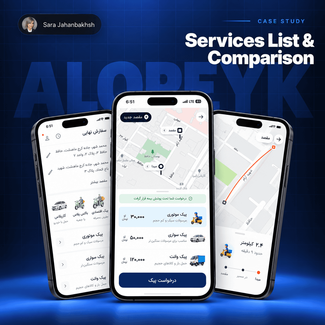
Helping senders compare delivery services by price, ETA and service type, without leaving the flow or relying on memory.

PRODUCTALOPEYKFOCUSMOBILE PRODUCT DESIGNEVIDENCEDesign task · usability findings and proposed iteration
Services List & Comparison cover
THE PRODUCT PROBLEM

One delivery decision.
Too many disconnected apps.

Senders already know what matters to them: price, delivery time and service type. What they do not know is which courier is the right choice.

To compare, they leave the flow, enter the same pickup and drop-off details again and hold the differences in memory.

PROBLEM STATEMENT

Decision ambiguity appears before commitment, exactly when abandoning the flow is easiest.

  • Information is entered multiple times
  • Criteria are held in memory
  • Comparison happens outside the system
01
USER SEGMENTS

Same task. Different priorities.

42%

Time-sensitive

JOB TO BE DONE

Send a package fast with minimal decision effort.

FRICTION

Delivery time is hard to compare across apps.

35%

Price-conscious

JOB TO BE DONE

Find the most affordable option without repeating inputs.

FRICTION

Prices are scattered and mental comparison is unreliable.

23%

Frequent senders

JOB TO BE DONE

Make quick, confident decisions based on prior experience.

FRICTION

Every comparison starts from scratch.

HYPOTHESES

What had to be true?

  1. A visible baseline makes decisions faster and more consistent.
  2. Even small price or time differences can change the choice.
  3. Highlighting meaningful differences reduces mental comparison.
  4. A clear reference point makes comparisons measurable.
02
RESEARCH & INSIGHTS

Turning uncertainty into design rules.

METHOD

Competitive analysis

AloPeyk · SnappBox · Tapsi

Reviewed how price, time and service type are surfaced in similar products.

01

Users need a baseline

A reference point makes similar options easier to judge.

02

Highlight the meaningful difference

Best-option emphasis reduces cognitive load and speeds decisions.

03

Balance overview and control

Show all options first, then let advanced users refine.

04

Sort by price + delivery time

A combined default is more useful than a single-variable ranking.

03
SUCCESS CRITERIA

Usability tied to business value.

01

Decision time

From landing on comparison to selecting a service

Faster decisions → lower drop-off
02

Comparison interaction

Filter, sort and criteria engagement

Clearer differences → better retention
03

Drop-off rate

Users leaving before service selection

Lower exits → higher conversion
04
DECISION LOGIC

A clear route from intent to choice.

1Enter app
2Select pickup
3Select drop-off
4Package type
5Compare
6See baseline
7Refine
8Select service
9Payment
BASELINE

Define the optimal price–time combination.

SIGNIFICANT DIFFERENCE

Call out variations above 15% in price or 20% in time.

ORDER

Rank options by the user's priority and the shared baseline.

05
SELECTED DIRECTION

Make the difference scannable.

9:41Select service→
PickupDrop-off

Choose the service that fits your priorities

MotorbikeFast & lightweight
15–20 min120K
BEST MATCH
VanFor larger packages
30–40 min250K
ExpressPriority delivery
10–15 min180K
01

Price + ETA together

The two strongest decision signals stay in the same scan line.

02

One visible recommendation

A baseline guides the user without hiding alternative options.

03

Progressive control

Advanced filters remain available without making the first view dense.

06
ITERATION

Test what users notice, not just what they complete.

METHODKEY FINDINGDESIGN RESPONSE
Usability testingNew users overlook detailsTooltips and microcopy
Heuristic reviewInformation density creates confusionStronger visual cues
Affinity mappingHierarchy drives confidenceHighlight meaningful differences
KEY OUTCOME58%

Frequent users performed better than new users, revealing the value of recognition, history and guided comparison.

NEXT ITERATION

Personalized AI recommendations

Suggest the best-fit service using a sender's priorities and decision patterns, while keeping the reasoning visible.

BUSINESS IMPACT

Value for every side of the marketplace.

USER

Better pricing

Transparent comparison and a partner discount.

PRODUCT

More engagement

A useful decision layer instead of another dead-end list.

BUSINESS

Sustainable revenue

Commission-based partnerships without deceptive patterns.

LEARNING & REFLECTION

Good comparison does not show more information. It makes the important difference obvious.

The next step is broader user testing, edge-case validation and an explainable AI layer that supports, not replaces, the user's decision.

INTERACTIVE PROTOTYPEOpen prototype in Figma ↗Opens in a new tab
KEEP EXPLORINGAll case studies ↗
© 2026 Sara JahanbakhshDesigned with clarity and curiosity ✦

Create a free website with Framer, the website builder loved by startups, designers and agencies.